CSS isn’t the kind of language that’s useful to learn in little half-steps — the part that people find difficult is dealing with handling styling when you are deep into creating an honest-to-goodness website with many levels of complexity.
The real skill comes in knowing how to plan for a multi-page site that uses a bunch of different snippets of code placed into a flexible layout that organizes content and data in a useful way.
- A core principle in programming: Don’t Repeat Yourself.
- Web Development?
- CSS overview
- The bog of eternal subjectivity
- Styling
- CSS values: color and sizing
- The Box Model
- How to align elements next to each other in the Model Box?
- Overflow property
- Display Properties
- Line Height
- Advanced Selectors
- Pseudo Classes
- Layout Basics
- Layouts with Flexbox
- Flexbox style options and shorthand
A core principle in programming: Don’t Repeat Yourself.
The idea behind DRY is that good coding should include as few instances of unnecessary repetition as humanly possible, simply because you have the same code in a bunch of places, then every time you want to make a change you’ll have to update all the different spots in the application where that code is repeated.
For example, if you wanted to change a link to the navigation bar of a hand-built site, you’d have to make the same change on every page. On a two-page site this wouldn’t be a big deal, but for a bigger website it would be a nightmare.
Web Development?
When someone says that they are a front-end developer, that means that they work on the parts of a site that people see and interact with. That includes things like HTML, CSS, and JavaScript. You’ll also hear people talk about user interface (UI) design (the way things look) and user experience (UX) design (the way that the interface and different pages function to move users through the site to a goal).
The complement to front-end development is back-end development, which involves the architecture of data, how it is stored, and how it is delivered.
CSS overview
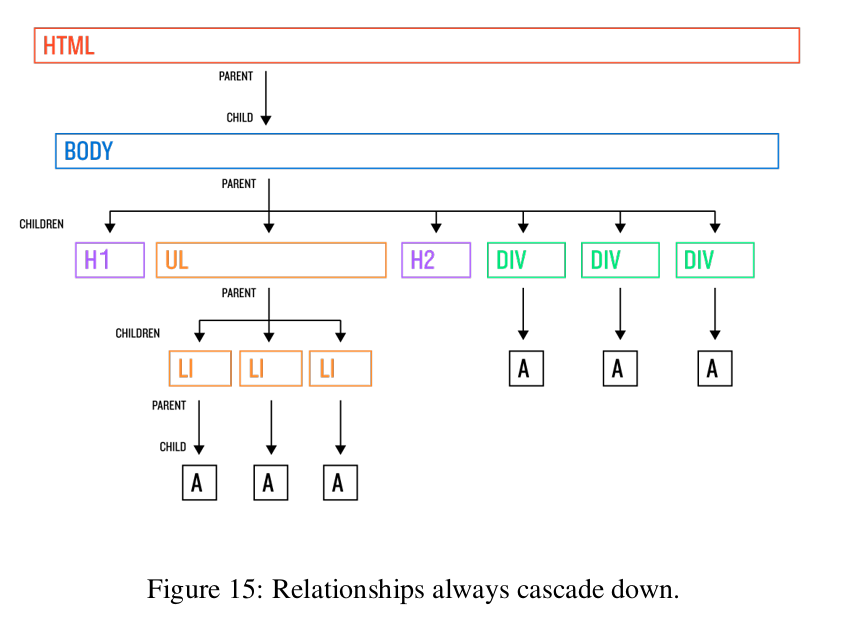
The “Cascading” part of Cascading Style Sheets refers to the way the defined styles flow, or “cascade”, down from element to element on a page based on a few factors like which declaration came first, whether an element is the child of a parent element that has styles applied to it, or the strength of the declaration.
This inheritance of style (from the top levels to elements below) happens so that we as developers can avoid having to define how every single element should look. For example, if we changed the color in the body tag in Listing 1, that change would cascade down and change the color attribute on every interior element as well.
Listing 1:
body {
  color: black;
}
The bog of eternal subjectivity
Deciding how to actually implement CSS on a given page can be a confusing mess.
-
When designing websites with CSS, many solutions to a problem typically exist, which means subjective judgment is the rule rather than the exception. We are now going to be venturing into places where there is often no right answer.
-
Oh, and to make this all a little more fun, every browser implements some parts of the CSS standard in its own slightly different manner, so you can never be absolutely certain that something will look the same to different users if they are using different browsers. . . To say nothing of how something will look on different screen sizes and resolutions for different operating systems.
-
You have to get used to the idea that no site is going to be exactly the same when viewed by different people. You’ll learn to design (or implement other people’s designs) in a way that allows room for CSS’s inherent ambiguity. Unlike the tightly constrained world of print design, getting things to look exactly the same in every browser and on every operating system is just something you have to give up worrying about.
-
Additionally, when talking about which CSS rules to use when styling a site or creating a layout, best practices tend to move in fads, or are influenced by the subjective opinion of the developers who worked on a project before you. \ For example, elements on the page frequently need to be assigned classes or ids, and the way that names are picked is entirely up to the person writing the code. As you might guess (if you know many developers or designers), people have lots of strong opinions on how you should be naming things; a classic holy war situation.
-
The most important thing is to be consistent. If you start a project and do things one way, make sure to keep following the same conventions for the life of the project. Or, if you decide to make a drastic change, spend the next couple of days updating all your old code, for the sake of future developers (including yourself).
Styling
-
CSS is a way of defining how elements on an HTML page look and are positioned, with styling that flows (“cascades”) down from element to element based on factors like which declaration came first, whether an element is the child of a parent element that has styles applied to it, or the specificity of the declaration.
-
In CSS the idea is that every element on the page is contained inside of another element, which in turn can contain other elements.
In CSS, styling rules flow down from parents to children unless another style interrupts and takes priority.
Formatting styles
CSS is similar to HTML in that white space is ignored by the browser.
For the sake of any humans viewing your markup, though, it’s a good idea to follow certain formatting conventions:
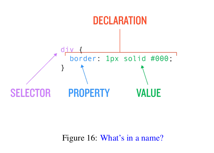
- Write your CCS rules as shown in Figure 16.
- Order your styles in alphabetical order
button {
  background-color: gray;
  border: 1px solid black;
  color: white;
  display: inline-block;
  font-family: "proxima-nova", "Proxima Nova", sans-serif;
  font-size: 12px;
  font-weight: bold;
  padding: 10px 15px;
  text-decoration: none;
  text-transform: uppercase;
}
CSS Selectors
So, how can we apply styling to specific elements rather than to every single one? There are two methods:
- one that targets only one element per page the
id(or “identification”) selector - and one able to target multiple elements the
classselector.
Ids and classes are always applied only to the opening tag of an element, and they always have the same format.
<div id="foo" class="bar">
.
.
.
</div>
Although CSS offers a great deal of flexibility in choosing id and class names, there are a few restrictions and usage suggestions:
- Use only one
idper element. - No numbers are allowed at the beginning of the name (e.g., name1 is valid, but 1name isn’t).
- Dashes ( - ), underscores _ , and CamelCase can be used to join multiple words (so foo-bar-baz , foo_bar_baz , and FooBarBaz are all valid names).
- Spaces are invalid in id names, and are used to separate multiple names in the case of classes (so id=”foo bar” is illegal, while class=”foo bar baz” places three separate classes on an element).
- Be consistent (e.g., if using dashes as separators, use them everywhere— don’t mix them with underscores).
To target an
idin CSS, you put a#(usually read “hash”) in front of the name\ To target aclassyou add a.(usually read “dot”)./* id */ #exec-bio { background-color: lightgray; } /* class */ .bio-box { border: 1px solid black; }Be sure that the element selected supports the property asignated otherwise it will just be ignored and no noticeable change will be seen.
The Style of the style
We can think of CSS as operating at two main levels: the browser and the text editor.
From the browser’s perspective, the exact choices for CSS classes and ids is irrelevant; indeed, as far as the browser is concerned, there is hardly any difference between beautiful self-contained CSS with perfectly comprehensible class names and horrible inline styles on every element.
At the level of the text editor, though, these concerns matter a lot to the people writing the HTML and CSS for the site.
- The browser might not care much about the repetition and complexity from inline styles and poorly named classes, but we sure do.
- Moreover, bad styling choices can haunt us throughout a project, so it’s important to do our best to get them right from the start (bearing in mind that we might have to make some changes down the line).
Naming Things
When coming up with names for classes and ids, it’s often helpful to think in terms of how something functions or what its intent is, and it’s usually best to be specific.
For example, making a class called box1 is a bad idea because the name is so generic; on a big project, you might not remember what box1 is when you come back to the code at some point in the future.
Avoid naming
classesoridsafter how the element looks on the page. Instead, use a naming convention where the class names are based on what the intended purpose is of the element on the page.
When and Why
One of the other decisions we have to make is to decide when we should use ids and when we should use classes.
ids are intended to target only one element on the page, while classes can target multiple things. To enforce this design, HTML elements will accept multiple class names on
a single object (separated by spaces), but allow for only one id per element
(anything after the first is ignored).
You should strive to use ids only when you absolutely have to
- The browser merges together all the different declarations and then sorts out conflicts property by property. This means that stronger declarations don’t override all styles on an object, only the properties that are included in that stronger declaration.
Priority and specificity
CSS was designed to allow for multiple stylesheets from multiple locations to influence the appearance of a single document without catastrophically crashing. The result is a system of priority and specificity rules devised to resolve contradictory style declarations.
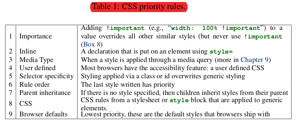
- Only numbers 3 and 5–8 are priorities that you’ll have to understand
- You should strenuously try and avoid using numbers 1 and 2 (makes for difficult-to-maintain code).
- Numbers 4 and 9 are out of your control.
OK, but now what happens when applying two styles that have the same priority? In this case, we need to consider specificity.
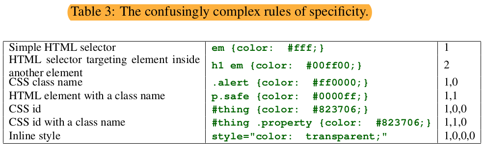
One way to avoid getting caught in situations where overlapping layers of complexity keep your styles from being applied is to try to keep your selectors as simple as possible
.bio-box a {
  color: green;
}
.alert {
  background: red;
}
rather than using an ugly and complicated set of selectors.
body div#exec-bio.bio-box a {
  color: orange;
}
How to be a good styling citizen
- Make design choices that are modular so that your styles only affect things inside of modules instead of leaking out to affect elements site- wide.
-
If you need to have a module do slightly different things depending on placement or status, multiple classes on an element are a valid usage of the class selector, but at the same time don’t take that to mean that you need to give every single element on the page a class, or (even worse) multiple classes. It’s a fine balancing act between under- and over-classing your markup.
- One good practice is to divide up the styling into two different categories:
- global styles that will apply in many different places in order to create greater consistency
- individual sections that are self-contained modules of functionality or content.
- Selector depth \
In general, and for a couple of reasons, it’s a good idea to keep the number of selectors in a declaration under three.
- One obvious reason you want your selectors to be as short as possible is for readability.
- The other reason is that CSS selectors are read by the browser from right to left, so the more selectors there are, and the more general they are, the more work the browser has to do to render your page.
It’s a little counter-intuitive, since you’d think that the browser would start on the left and narrow down the scope of the styling by moving right. . . but for technical reasons it doesn’t. So if you declared a style using
#first-tabletrtdh1, the browser would first identify allh1s, then alltds, then alltrs, and finally restrict everything to just the elements that are in something with an id of#first-table.
If you have lots of elements on a page, this kind of inefficiency can really slow down rendering times, so keeping the number of selectors down is good both for us (the developers) and for our users.
- Use wrappers to surround sections in the page to lessen the complexity of the CSS rules.
- Use CSS comments to group the styles thematically, according to which elements affect.
CSS values: color and sizing
CSS colors
Hexadecimal RGB(A) colors
The reason the color system is called hexadecimal RGB is that it uses base-sixteen numbers instead of the usual base ten. In base ten, we can count from 0 to 99 with two digits, where 99 = 102-1. Similarly, hex lets us count from 0 to ff = 162-1 = 255. \ In other words, putting two hex numbers next to each other lets us count from 0 to 255 using just two characters, with 00 = 0 and FF or ff = 255 (CSS hex is case-insensitive, so it doesn’t matter if you use upper- or lower-case letters).
Shorthand: #ffcc66 ≡ #fc6; the browser will fill the missing ones.
In addition to using RGB hex, you can also use RGB directly using rgb(), which allows you to use decimal numbers in place of hex. In other words, rgb(255, 255, 255) is the same as #ffffff, etc.
But the main reason to use RGB directly is to set transparency via the rgba() command. The alpha level is indicated using a number between 0 and 1, where 0 is transparent, 1 is opaque, and decimals in between define all the levels of partial transparency (50% is 0.5, 25% is 0.25, etc.).
CSS Sizing
Pixels (try to not use them)
- Absolute measurement defined as 1/96 of an screen inch (DPI 96). Warning: pixels at the software level are not directly related to physical pixels.
Absolute sizes were fine for the period when pretty much all screens had the same characteristics (and there were no other options), but over time screen sizes, resolution, and densities proliferated, and the inflexibility of absolute font sizes made relative sizing the preferred method.
Percentages (regulary used for sizing boxes, margin, padding)
- Relative measurement, based on the parent container that an element is wrapped by—it isn’t determined by the size of the browser, or the page as a whole.
- Percentage heights are a little weird because they require a set height on the parent element—they can’t just assume a height the way that they assume a width.
- They don’t work at all for thickness—meaning you can’t use percentages for borders.
- Percentage fonts (infrequently used).
- If you use a percentage for a text size, the resulting size of the font is based not on the pixel dimensions of the container but rather on whatever
font-sizestyle that container has inherited.
So the box itself could be 1000px tall, but if it inherited a font size of 16px , and you set the font size of a child element to 50%, you are going to get only an 8px-tall font (50% of 16px ), not a 500px-tall font like you might think.
- If you use a percentage for a text size, the resulting size of the font is based not on the pixel dimensions of the container but rather on whatever
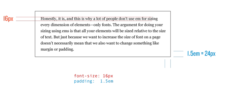
em (prefered method for font-size)
- Relative size unit that is commonly used for sizing text.
- In CSS, one
emrepresents a number of pixels equal to the current font size of any given element’s parent container.- To determine what the actual font size should be, the browser crawls up the parent/child tree until it finds a parent with a font size set with an absolute value, and then it calculates back down (they are cumulative) the tree to set the font sizes.
- If there is no font size that is inherited, then the default page font size is used (16px)
- Fractions of an
emrepresent fractions of the full font size.
- They automatically change value based on the font size that is inherited by the parent object that they are contained in. \
This means that if you used
emsizing throughout your site, you can modify the entire site’s text simply by changing a single base font size, and all the fonts in all the child containers will resize in correct proportion based on this new declared font size. - Can be used for things like margin, padding, and width; but be careful, if you modify the local font size this values will also change accordingly.
rem (*root em**)
- Works similarly to
em, is a percentage of an absolute font size, but instead of being cumulatively sized based on the whole parent/child tree, theremunit always refers back to the font size of thehtmltag—in other words, it always refers to the most basic font size for the whole page. remis especially useful in combination withemunits in developing modules.- The best practice is to set a font size for the module’s wrapper using a
remunit, and then style the fonts inside usingemunits. - This kind of styling allows you to create modules that can be safely dropped into any part of a page, while keeping the advantages of using relative font sizes.
- The best practice is to set a font size for the module’s wrapper using a
vh, vw (incredibly useful for responsible -mobile- layouts)
- Absolute measurement determined by the size of the browser window or device screen.
- Each
vhorvwis 1 percent of the corresponding screen dimension, so3vhwould equal 3% of the height of the screen and100vwwould be 100% of the width. - As with all the other values, viewport dimensions work for fonts too, so if you resize the browser you’ll notice that the font size changes.
Pleasing fonts
- When choosing font sizes, the goal should always be to have readable text on the page. Nicely laid-out copy should be the equivalent of somewhere between 14px and 18px in height.
- Trying to achieve pixel-perfection is simply not a reasonable goal on the Web, and pixel sizing is really just an artifact from the bad old days of doing designs in Photoshop where elements heights and widths were set in pixels.
Just embrace the imprecision.
The Box Model
The browser considers a page to be a collection of different boxes that contain content. \ Along with height and width, boxes can be styled to have:
- borders - a line around the box
- margins - the distance away from other boxes
- padding - empty space inside the box separating content from the border
The CSS Box Model is the name for all the rules that determine how height, width, margin, padding, and borders are applied to elements.
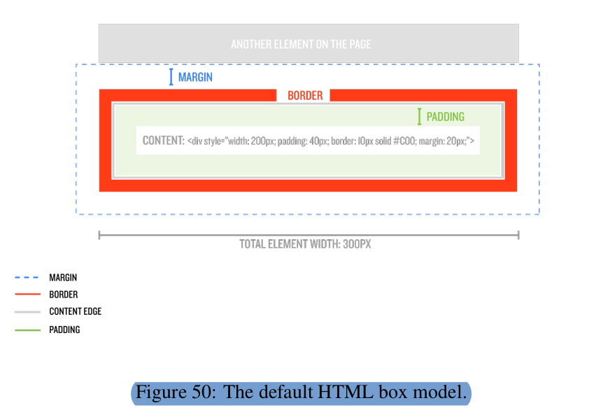
The margin and padding properties control the space around or inside of elements, while the border property specifies the appearance of the boundary of the box.
- In the default state, CSS assumes that when you set a size for an element you are only talking about the content part of an element, and the additional
borderorpaddingwill go outside of the content Fig. 50 (i.e you can end up with an element that is bigger than the dimensions that you specified).- It is possible to fix the total width of the content box, and force the border and padding to fit inside. The way to do this is with the
box-sizing: border-boxdeclaration.
- It is possible to fix the total width of the content box, and force the border and padding to fit inside. The way to do this is with the
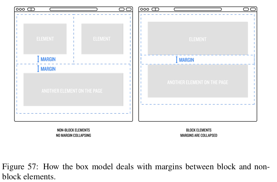
marginsalways apply outside of an element. So even though we’ve set thebox-sizingstyle out element will be bigger that expected.- When two block elements with margins follow each other, one of the top or bottom margins is canceled out.
Margin for boxes
- The CSS margin properties are used to create space around elements, outside of any defined borders.
- With CSS, you have full control over the margins. There are properties for setting the margin for each side of an element (top, right, bottom, and left) e.g.
margin-top: 3%; margin-right: 3%; margin-bottom: 3%; margin-left: 3%; - There exist a shorthand to write this properties, that allows each side to have different value;
margin: 3% 3% 3% 3%;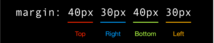
- An even shorter version, that allows different values top-bottom from those on right-left.
margin: 3% 3%;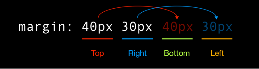
- The biggest shorthand, that will apply the value in all directions.
margin: 3%; - You can also make margins negative for elements. This draws the element up and out of the normal place it occupies on the page and overlays it on content that normally it wouldn’t be able to affect.
As a trick to center elements on the parent container, you can use:
margin: autoto center in all directions, ormargin: 0 autoto center in the width of the parent container.
Padding
- Padding is similar to margins, except instead of pushing away things outside the element, padding pushes the content inside an element away from the edges of the element.
- This is ideal when you want to have a box containing text have a background color or a border but you don’t want the text ending up smashed against the edge of the container.
- Padding values are declared using the same syntax as for margins, including the shorthand
Borders
- Borders also work similar to margins and paddings, including the shorthand.
- The
borderproperty is a shorthand property forborder-top,border-right,border-bottom,border-left. -
The
borderproperty, and its directional definitions, are a shorthand property forborder-width,border-styleandborder-color.Where:
- The
border-styleproperty specifies what kind of border to display. The following values are allowed:dotted, dashed, solid, double, groove, ridge, inset, outset, none, hidden. -
The
border-widthproperty specifies the width of the four borders. The width can be set as a specific size (inpx,em, etc) or by using one of the three predefined values:thin,medium, orthick. - The
border-colorproperty is used to set the color of the four borders. The color can be set by:- name - specify a color name, like “red”
- Hex - specify a hex value, like “#ff0000”
- RGB - specify a RGB value, like “rgb(255,0,0)”
- transparent
If border-color is not set, it inherits the color of the element.
- The
So when using
borderby starting with a more generic style and then adding another style that changes some specific element (using the precedence rule), you can often accomplish a lot of work in just a couple lines of CSS.
- The border can also have a radius set, which creates a box with rounded corners.
Want to see how to make circles using just HTML and CSS? The trick is to give the elements a set
widthandheight, and then make theborder-radiusbigger than the width of the element, while also making sure the height and width of the element are equal (so that the “box” is a perfect square).
Inline vs. Block
- Inline elements re only allowed to have margins and padding applied to the left and right (not top or bottom), and they won’t accept a width or height set by CSS.
- Block don’t have restrictions, take the entire width of its parent element.
Floating inline-elements makes them block-elements.
How to align elements next to each other in the Model Box?
Floated Elements
- The idea is that when you set an element to float to the left or right (there is no
float: center), all the inline content around it will flow around the floated element like water. - Floated elements will always sit next to other floated elements on the same line, as long as there is horizontal room. If the elements are too wide, they will drop down to the next line.
Why might a developer not want to always use floating to get elements to line up side-by-side?
- There are only two options,
float: leftandfloat: right, but no float: center . That’s annoying, but manageable. -
The bigger problem is that the browser doesn’t always know where to end the float. \ When you float elements, you are telling the browser that you’d like the element to show up on the page in the place it would naturally “float” to, but after that starting position you want the rest of the page content to flow around the floated element.
##### There are two ways to fix this.
-
clear: bothstyleIf you want the next elements to initiate in a new line you have use the
clear: bothrule on the element following the float, to let the browser know to end floats.Ejemplo:
<div class=".bio-box">
  ...
</div>
<p>Some text here</p>
.bio-box { float: left; }
p {
  clear: both;
}
Having to add a clear style directly onto any element (either inline or in the stylesheet) after floated elements is kind of a pain—especially on a dynamic site that might pull in snippets of code to build a page. You don’t always know which elements will be following floats.
-
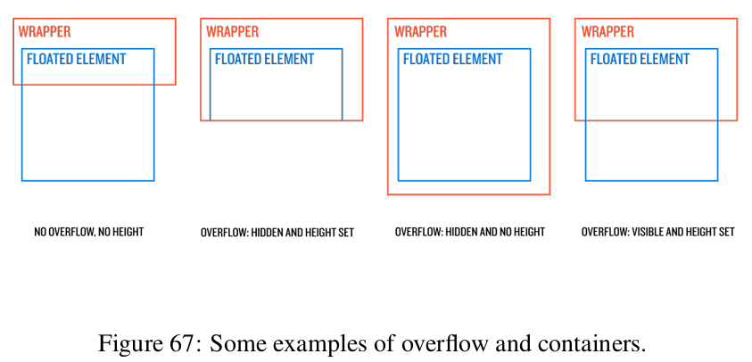
Wrappers
A better way to clear floats is apply a rule to clear everything inside a wrapper.
The idea is to arrange for the wrapper element, and everything in it, to act like a Lego block that can safely be moved around without needing to worry about uncleared floats messing up a layout.
There are two methods to clear floats inside a wrapper: the
overflowmethod, and the:after“clearfix” method.-
- The wrapper separates the content floated from other elements on the page.
- The overflow CSS property specifies what to do when an element’s content is too large to fit in its block formatting context.
The problem with this method is that if you also need to set a height or width on the element that has
overflow: hiddenset, the content inside can get cut off. This usually happens on poorly built dropdown menus where the header has to have an specific height.
So, if you need to clear floats but also are worried about content being cut off because you absolutely, positively have to set a height on the wrapper element, you can use the
:aftermethod. -
- Creates a kind of imaginary element that comes at the end of the wrapper —an imaginary element that we can add styles to!. Setting
clear: bothon that element clears the floats and allows the content below to appear as intended.
- Creates a kind of imaginary element that comes at the end of the wrapper —an imaginary element that we can add styles to!. Setting
-
-
Inline-block
The second way to get things next to other things is to set the elements to be display: inline-block.
This allows them to keep their block-style formatting (so they can have height and top/bottom margin and padding), while also letting us do things like control an element’s position on a line of text by setting the style text-align on a wrapper to make everything align left, right, or center.
Notice that there are little spaces between the elements when using this technique, and it stems from the way that browsers treat inline-block elements as though they are just funky-shaped words in a sentence, although there are ways to get rid of that space. (For the record, when you use a float to get elements next to each other, there is no space between them at all.)
Overflow property
The CSS overflow property tells the browser how to handle content inside a wrapper, if that wrapper has a set height or width. If the content in the wrapper doesn’t fill the box, then overflow does nothing, but when there is more content than room to display that content, overflow comes into play.
The overflow style can be set to:
- visible - shows everything;
- hidden - cuts content off at the boundaries of the wrapper;
- scroll - adds scroll bars to let you scroll up and down or left and right to see all the available content.
overflow: hiddenworks for clearing floats because it makes the browser want to keep content contained entirely within the wrapper.
Display Properties
display: none
- Prevents the element from displaying on the page.
- Commonly used for hiding elements in interactive websites, especially when combined with JavaScript.
display: block
- Block forces an element to be a block element regardless of what it was before.
- If you don’t set dimensions after changing an element to
display: block, it will behave like any normal block element by taking up the entire width of its parent element.
display: inline
- Turns a block element into an inline element (essentially the opposite of the
display: blockproperty). - Any styles that don’t apply to inline elements (such as width and height, top margins, or padding) will be ignored.
- The element will flow with text like any other inline element.
display: inline-block
- Is a hybrid between inline and block.
- It allows styling that normally works only on block elements —such as width and height, top margins, and padding— to be applied to a particular element.
- It also lets the element as a whole act like an inline element. This means that text will still flow around it, and it will only take up as much horizontal space as it needs to contain the content.
display: flex
- A powerful display property that forces all child elements to fill the entire parent element, and is highly customizable to allow for incredibly useful layout possibilities.
Line Height
- Defines the space above and below text and other inline elements.
- Any text on your site that is multi-line should have the line-height increased to make reading easier. An ideal amount would be around 140% to 170%, depending on the font.
- The line-height property works like em in that 1 equals 100% , but there’s no associated unit as with em , px , etc.
Advanced Selectors
| Selector | Description | Example |
|---|---|---|
child selector (>) |
Select only elements that are direct children of the parent selector. | |
adjacent sibling (+) |
selects a single element only if its right next to the primary element in the declaration. | h2 + p selects a p tag only if it is immediately preceded by an h2 tag. |
general sibling (~) |
selects all elements of the type in the declaration if they follow the primary element. | h2 ~ p applies to all p tags preceded by an h2 tag. |
pseudo-class (:fitst-child) |
applies the corresponding styles only to the first child of the parent element. | |
pseudo-class (:last-child) |
similar to :first-child targets the last child of a parent. |
|
pseudo-element (:before) |
by default an inline element, will show before the element. |
work as if you added a span into a line of text, gave it a class, and then styled it. |
pseudo-element (:after) |
by default an inline element, will show after the element. |
work as if you added a span into a line of text, gave it a class, and then styled it. |
Pseudo Classes
All HTML links have a set of what are called pseudo-classes that allow developers to style different interactions with the link:
:hover: styles what happens when a user rolls over the link (applies to any element, not just links).:active: styles what happens when a user clicks the link.:visited: styles what the link should look like if a users has already visited the linked page.
The way to add a pseudo-class to a style declaration is by combining the element or class name with the pseudo-class, like this:
.header-nav a:hover {
  color: #ed6e2f;
}
Layout Basics
Style Note: Mobile hover consideration
Mobile users don’t see rollover states, so you always need to be sure that the things you are designing will make sense to both mobile and desktop users. One way to do this is to make sure that you also style things so that there is a change when the link is actively clicked. You might think that this would be something that happens automatically no matter what, but if you make any styling changes that alter links from their browser default, you will actually need to use the
:activepseudo-class to define how you want a link to appear when someone interacts with it. An example would be:.header-nav a:hover, .header-nav a:active { color: #ed6e2f; }If you do end up removing all hints that something is clickable for your site on desktop, you might want to consider using a mobile media query to add in some hints specifically for mobile users.
Positioning
When you style an element’s position, there are two basic possibilities:
- Have the browser draw the element in its natural position in the normal flow of content on the page.
- Remove the target from the flow of content and display it in a different place using directional styles —left, right, top, and bottom— and an additional dimension, the so-called
z-index.
When an element is moved around out of its natural position with directional styles, it doesn’t affect other elements in the document — it either covers them up or is hidden behind them (using the z-index).
In order to change those directional styles, we first need to alter an element’s position property. The position style in CSS can be given five different values:
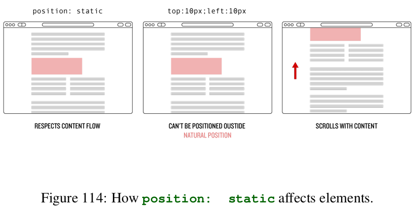
positioning: static- This is the default positioning of elements in the flow of content.
- An element that has no position style set, or has position: static , will ignore directional styles like left, right, top, and bottom.
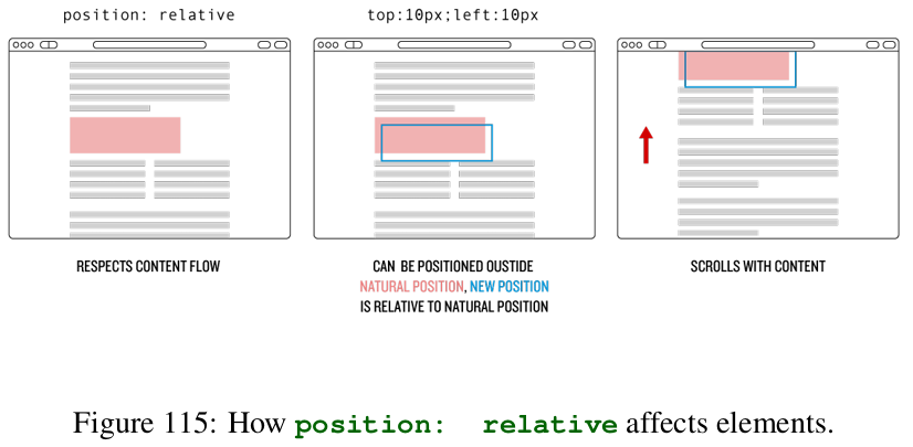
positioning: relative- This is like static in that it respects the element’s starting position in the flow of content, but it also allows directional styles to be applied that nudge the element away from the boundary with other elements.
- It allows absolutely positioned items to be contained within, as though the relatively positioned element were a separate canvas; i.e. if an absolutely positioned element is inside a relatively positioned element, a style of
top: 0would cause the absolutely positioned element to be drawn at the top of the relative position element rather than at the top of the page. - Also allows you to change the z-index of the element.
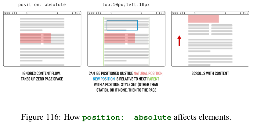
positioning: absolute- Positions the element at a specific place by taking it out of the document flow, either within a parent wrapper that has a
position: valueother than static, or (if there is no parent) then a specific place in the browser window. It is still a part of the page content, which means when you scroll the page, it moves with the content. - The directional styles don’t add or subtract distance — setting
bottom: 50pxdoesn’t move it toward the bottom, but rather it sets the position50pxfrom the bottom. - Also lets you define a
z-indexproperty. - Because the element is removed from the document flow, the width or height is determined either by shrinking to the content inside, or by setting dimensions in CSS. It behaves kind of like an element set to inline-block.
- Causes any float that is set on the object to be ignored, so if you have both styles on an element you might as well delete the float.
- Positions the element at a specific place by taking it out of the document flow, either within a parent wrapper that has a
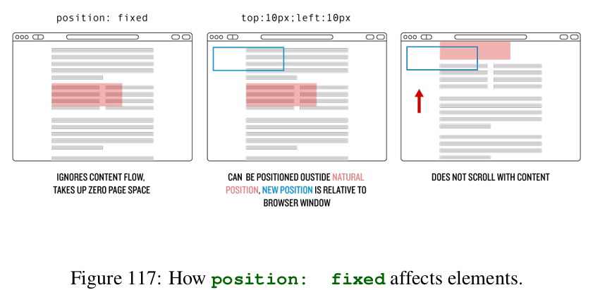
positioning: fixed- Positions the element at a specific place within the browser window totally separate from the page content. When you scroll the page, it won’t move.
- Lets you set
z-index. - Has the same need to have dimensions set as
position: absolute; otherwise, it will be the size of the content inside. - Also causes floats to be ignored.
positioning: inherit- Not very common in use.
- It makes the element inherit the position from its parent.
Considerations
- If set both a top and bottom, or a left and right, the top and left properties will take priority and the bottom and right will be ignored.
- When you set a position property, you are manipulating elements and messing around with the natural page flow, which means that it is possible to cause misalignments.
So if you add
left: 200pxto a element with width of 100% it isn’t recalculated. Instead, the entire element is pushed over by200px, and your browser window will have horizontal scroll bars and look broken.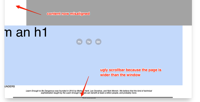
- How do you center an absolutely positioned object horizontally and vertically in a way that allows the object to be any size, and allows the wrapper to be any size?
- Give the element a style of
left: 50%andtop: 50%, but this won’t work because when the browser positions an object it calculates the distance using the same edge on both objects — so when you applytop: 50%, it moves the top of element 50% away from the top of the parent, and same with the left hand side. \ What that means is that the object you are trying to position is off-center by half of its width and height - There is a relatively new CSS style called
transformthat can help solving this issue. - The
transformproperty allows developers to do all sorts of crazy things like move objects around, rotate them, or simulate three-dimensional movement. - The upside for centering objects is that this new style calculates all these movements based on the object itself. So if we move it 50% to the left using transform , the browser looks at the object’s width, and then moves it to the left 50% of its own width, not the width of the parent.
- The actual style declaration looks like this:
transform: translate(x, y)— where x is replaced by the distance along the x-axis (left is negative, right is positive), and the same for the y-axis (up is negative, down positive). - So the result will be:
.element {
position: absolute;
left: 50%;
top: 50%;
transform: translate(-50%, -50%);
}
- Give the element a style of
Layouts with Flexbox
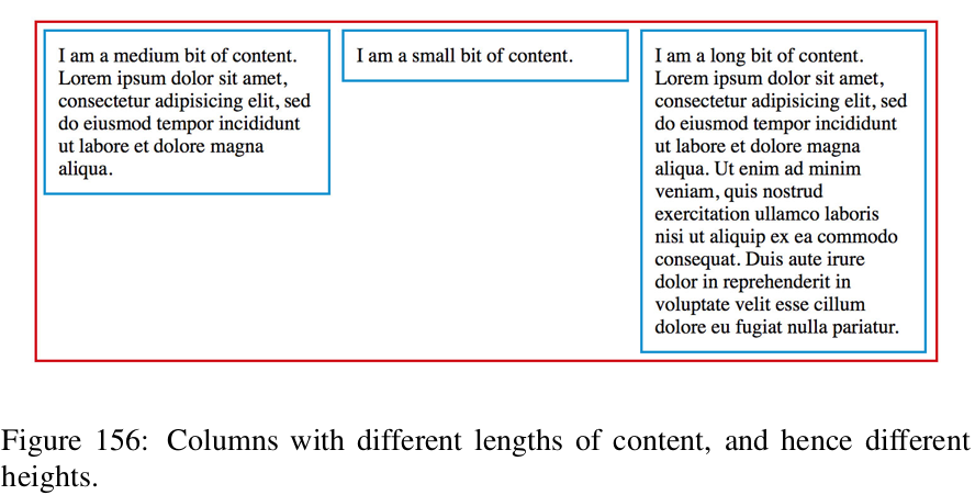
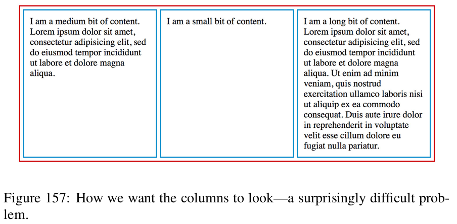
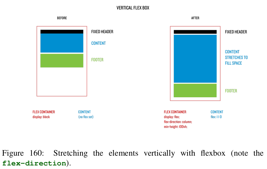
- CSS flexbox is a flexible box model for laying out content on the Web.
- Flexbox, which is a relatively new addition to CSS, makes it possible to style sections of a website to allow the sections to fill a space, while also still being able to adapt to the content.
Without flexbox
With flexbox
Flexbox Anatomy
- There are two main aspects:
- flex container: is the HTML element with the CSS property
display: flexset. - flex items: is a child element that has some value of the CSS
flex:property set.
- flex container: is the HTML element with the CSS property
- Essentially, the flex container encloses the items, which can be aligned, stretched, shrunk, etc., by various flexbox style rules.
Note: You can use flexboxes within flexboxes; i.e. you can set a flexbox item, to have
display: flexset.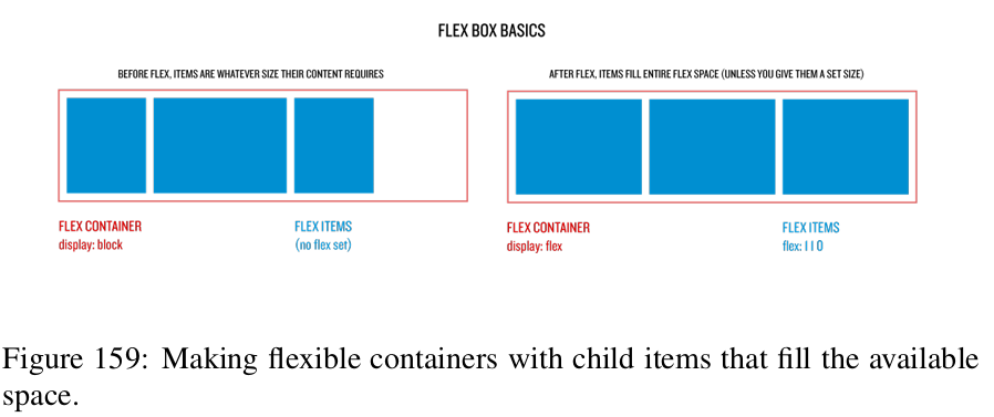
Flexbox Item Properties
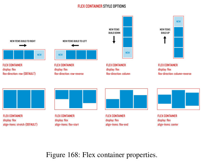
align-items: specifies the default alignment for items inside the flexible container.- Tip: Use the
align-selfproperty of each item to override the align-items property. - By default, every element has a
align-items: strech.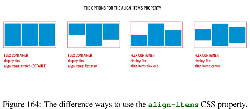
- Tip: Use the
flex-grow: control how flexbox items expand.- By default, items in a flex container have a
flex-growvalue of0, which means the item doesn’t grow at all.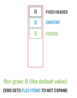
- The
flex-growproperty works by proportions: if all three items are set to1, each one takes up 1/3 of the space available. If only an item is set toflex-grow: 1that item will grow to take all available space.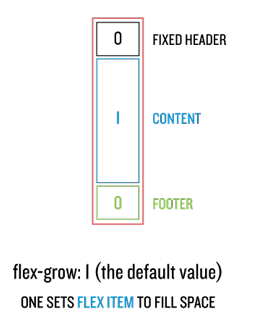
- By default, items in a flex container have a
flex-basis: which is a property that controls the original (“basis”) width of the element.- By default, every element has a
flex-basis: auto.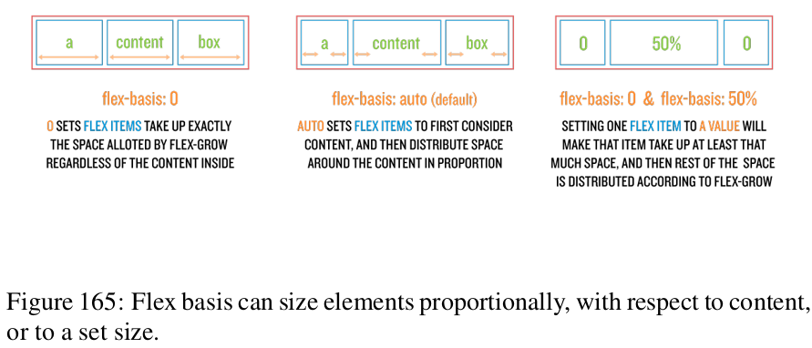
- By default, every element has a
flex-shrink: specifies how the item will shrink relative to the rest of the flex items inside the same container.- Similar to
flex-growit works by proportions, so aflex-shrink: 2will shrink the double offle-shrink: 1.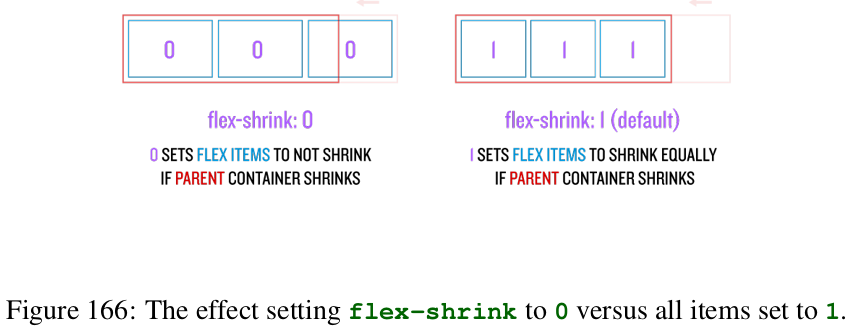
- Similar to
Flexbox style options and shorthand
flex: is a shorthand for all three styles applicable to flex items.flex: <flex-grow> <flex-shrink> <flex-basis>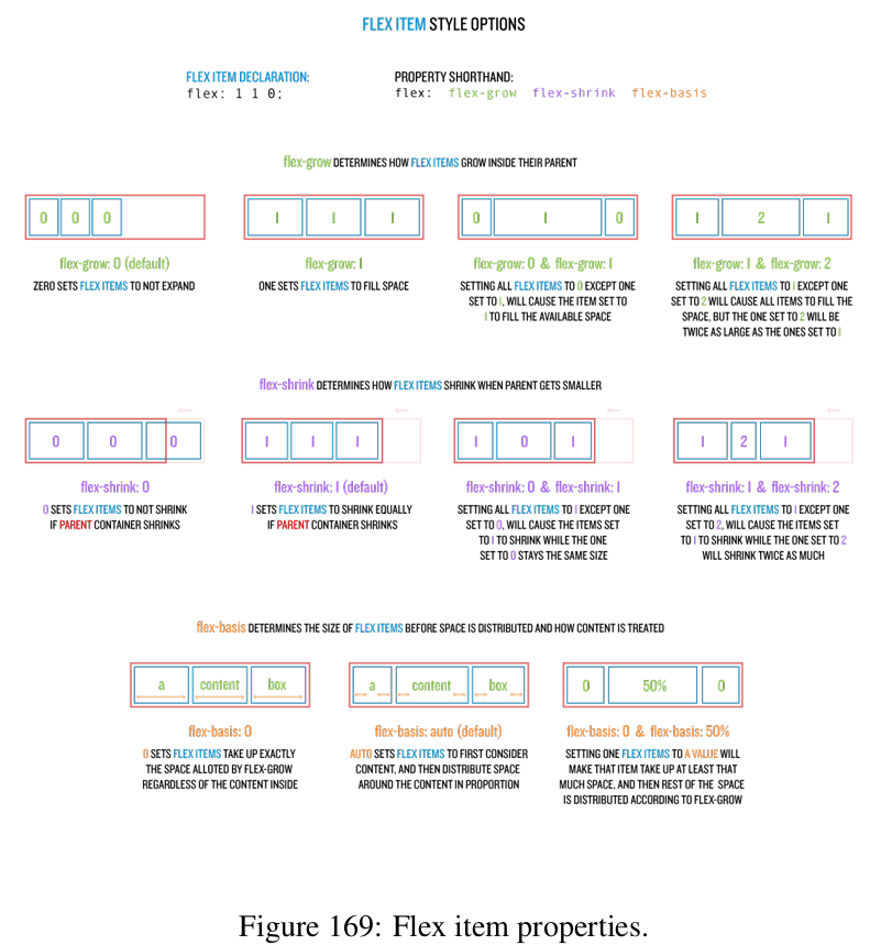
- An event smaller shorthand is
flex: 1which is equivalent toflex: 1 1 0%;